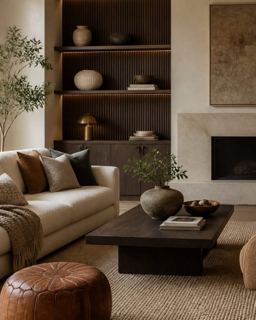
White walls still work. What stopped working is the whole room being white.
Stark white became the default because it photographs beautifully and gives black hardware and pale wood a clean backdrop. Live in it for a year, though, and a room with white walls, white upholstery and very little material contrast tends to feel flat rather than calm.
The fix isn’t colour for the sake of it. It’s choosing neutrals that actually have an undertone, then giving them texture and a bit of depth to work against.

Why stark white is giving way
Natural light changes every white paint you put on a wall. A north-facing room can push a crisp white towards blue-grey; strong southern or western light can make the same colour glare. Neither is the paint’s fault, and neither is fixable with a different white.
Daily use matters as much as light. Bright white upholstery, grout and cabinets show scuffs and dust fast, which is worth thinking about honestly before you commit a whole house to it.
You can keep everything you liked about a minimal room — the clarity, the calm, the lack of clutter — by moving to soft ivory, putty, mushroom, sand or muted taupe. They still read as light. They just have a visible undertone that stops the room looking clinical.
Choose undertones before you choose paint
Start with what you can’t change: flooring, stone, cabinetry, tile and any large upholstered piece. A paint that looks like a simple warm beige on a chip can read yellow, pink, green or grey once it’s next to those.
Match the paint’s undertone to whatever already dominates the room.
| If your room has… | Look at… |
|---|---|
| Honey oak, tan stone, brass | Cream, sand, caramel, warm beige |
| White oak, linen, olive accents | Mushroom, green-leaning beige |
| Black metal, walnut, charcoal | Taupe, brown-backed greige |
| Terracotta, aged brick, rosy wood | Plaster pink, muted clay |
Then test large samples on more than one wall, including one that stays shaded, and look at them morning, afternoon and evening. A taupe can turn purple. A greige can go cold in a north room. Small chips will not tell you this.
Build dimension with layered tones
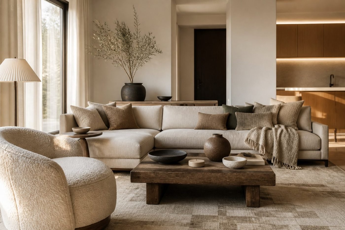
Don’t put one neutral on every surface. Use three levels that share an undertone but differ in depth: a light base on the walls, a mid-tone in upholstery, rugs and curtains, and a deeper contrast in woodwork, lampshades, art or an accent chair.
Cream walls with mushroom linen curtains, a warm beige rug, walnut furniture and darker taupe cushions all differ in value while staying connected by the same brown undertone.
Curated Manor may earn a commission from qualifying purchases at no additional cost to you. As an Amazon Associate, I earn from qualifying purchases.
Texture is what keeps those tones from collapsing into one beige surface. A real wool area rug has depth that a flat synthetic doesn’t, and it changes how the whole floor reads. A ceramic table lamp with a matte glaze adds a warm, handmade note at eye level. Velvet pillow covers give you a deeper tone in a small dose you can change your mind about.
Availability changes often, so check before you buy.
Use moody colour with intention
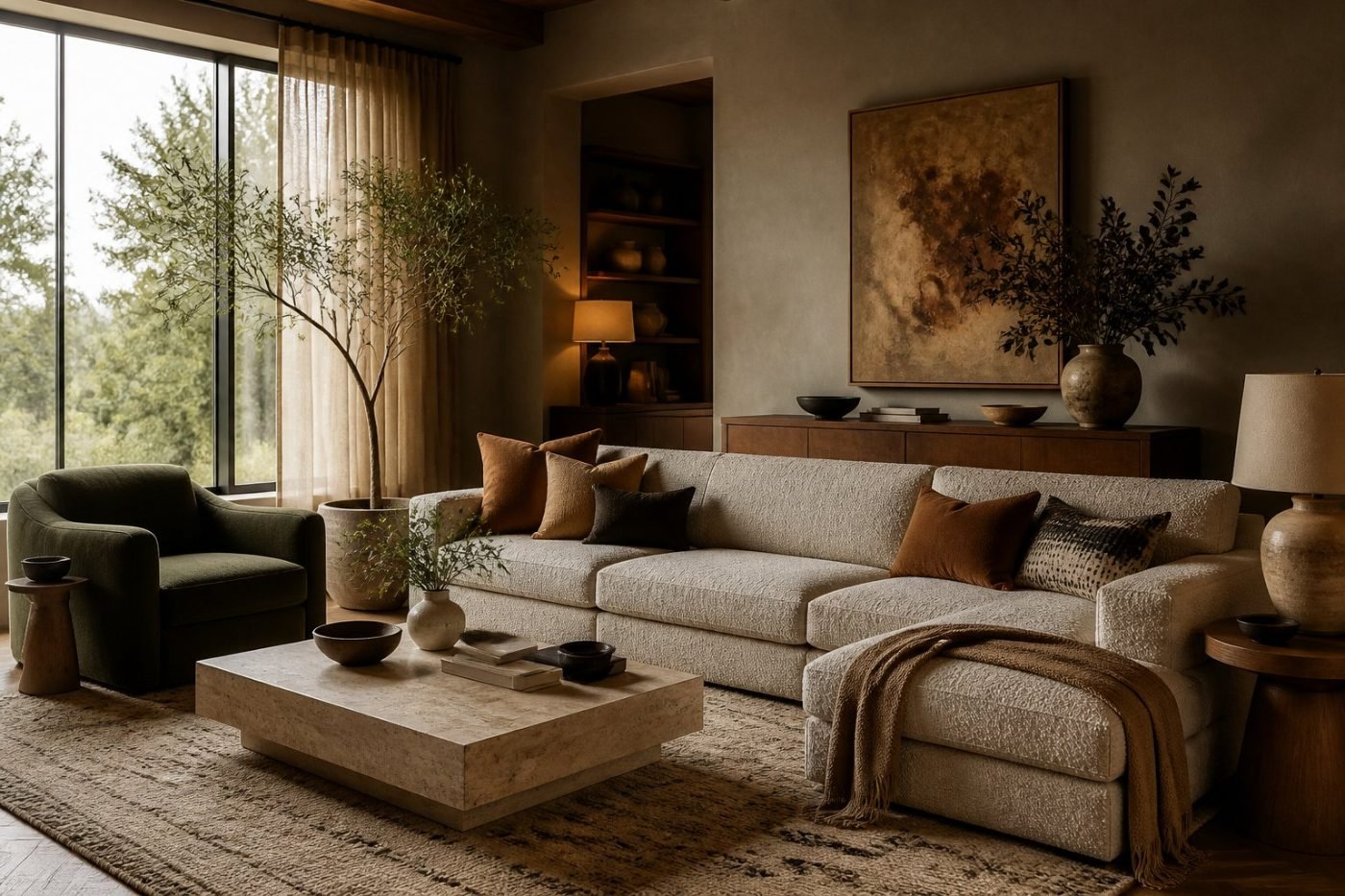
Deeper colour works best where it defines what a room is for. Espresso brown, deep charcoal, forest green and burgundy suit rooms you use in the evening: dining rooms, libraries, snugs. They sit especially well with warm wood, aged brass, linen and wool.
Let the light decide the hue. A sunny room can carry deep green or oxblood across several walls; a north-facing room usually feels better with a warmer olive or a brown with red in it.
If a full room feels like too much, put the colour on something architectural instead — built-in shelving, a panelled wainscot, interior doors — and keep the larger wall areas in warm neutrals. A dark ceiling can also make a tall room feel better proportioned, particularly if you echo the shade in curtains or upholstery.
Whatever you choose, add light back in. Brass hardware, antique mirrors, glazed ceramics and warm bulbs stop a dark colour from flattening the room.
Ground it with tactile materials
Warm colour needs honest material underneath it or it just looks like paint. Use wood to offset the weight of stone, and let stone keep its irregularity rather than choosing the most uniform slab available.
Natural fibres do the same work more cheaply. Linen filters light gently at a window; wool adds depth underfoot. Mix the scale of the weaves rather than repeating one texture — a nubby rug against smooth linen against a tightly woven throw.
Woven storage helps too, and it’s genuinely useful. A set of woven storage baskets keeps the clutter that makes a warm room feel messy rather than lived-in out of sight. Outdoors and in, a terracotta planter brings an unglazed, earthy note that sits naturally with clay and olive tones.
Keep it cohesive
Pick one warm base neutral, one deeper colour and one restrained accent. Mushroom walls, an olive chair, small amounts of aged brass is a complete scheme; you don’t need a fourth idea.
Keep undertones aligned. If your walls lean warm, don’t introduce an icy grey or blue-white into the mix — that single cold note is usually what makes an otherwise good room feel unresolved.
Then repeat two or three materials so the room reads as one thing: a consistent wood family, one dominant metal, one textile story across linen, wool and bouclé.
Finally, use warm bulbs. Somewhere around 2700K to 3000K in living rooms and bedrooms supports wood, textiles and warm paint; cooler bulbs drag out the blue and grey undertones you just spent all this effort avoiding.
If you want the furniture side of this rather than the paint side, our piece on collected luxury covers how the same idea plays out in upholstery, wood and metal.