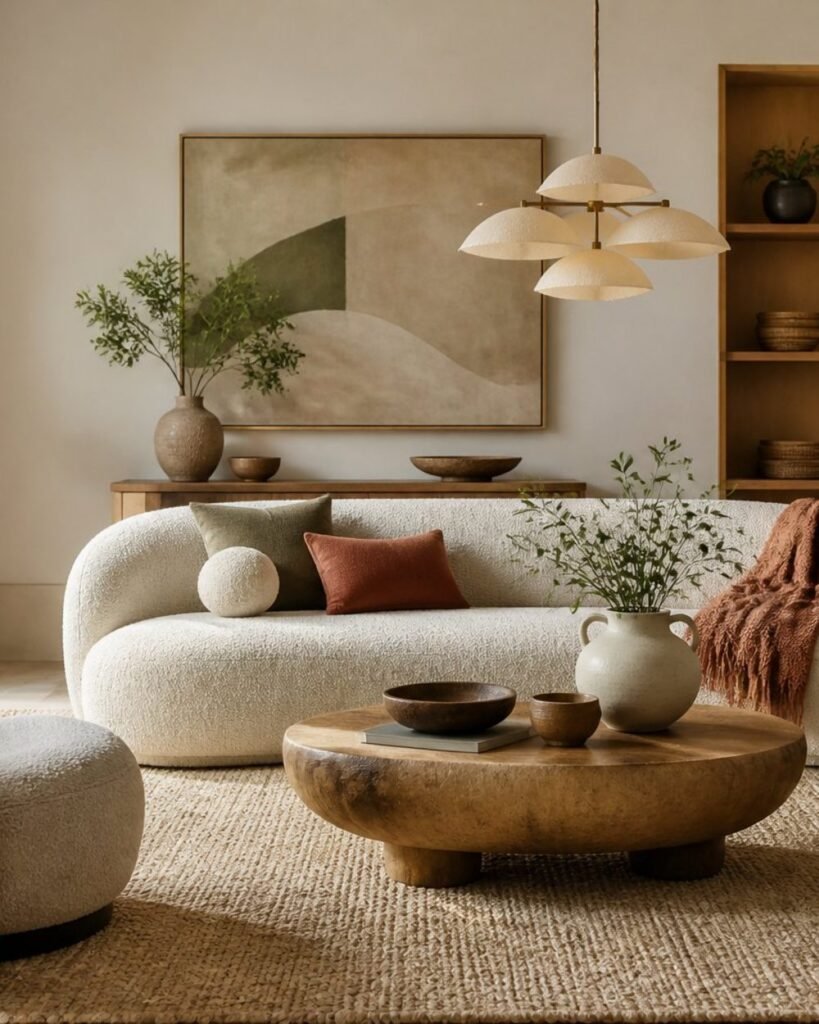
The interesting thing about where interiors are heading in 2026 is how little of it requires buying new furniture.
The shift is away from stark, photogenic rooms and towards ones with warmth, texture and some evidence that a person lives there. That’s mostly achieved through colour, materials, lighting and a few pieces with character — not through replacing what you own.
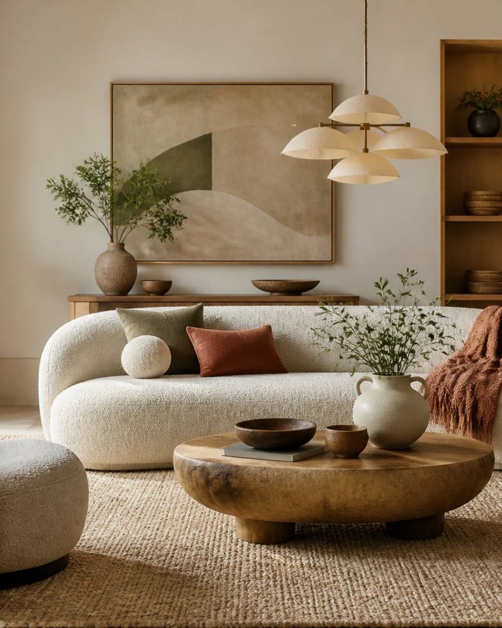
Warmth is replacing sterility
Warm minimalism keeps the discipline of a simple room and drops the unfinished feeling. Instead of all-white walls and matching furniture, the palette moves to warm whites, putty, clay, caramel and soft olive.
Let daylight lead it. Linen or woven shades filter light rather than blocking it, then lamps with fabric, paper or ceramic shades take over in the evening. Floor-length linen curtains hung close to the ceiling do more for a room’s proportions than almost anything else at the price.
Curated Manor may earn a commission from qualifying purchases at no additional cost to you. As an Amazon Associate, I earn from qualifying purchases.
The other half of the shift is selective maximalism — not crowded, but personal. Antiques, books, art and objects that mean something, mixed in with new basics. A useful editing rule: every visible item should add function, texture, colour or meaning. If it does none of those, it’s filler.
Availability changes often, so check before you buy.
Build a grounded palette
Start with a warm white, sand or taupe on the largest surfaces, then add depth through one restrained accent rather than several competing shades. Terracotta, clay, ochre, rust, olive, blue-green and charcoal all work.
| Base | Accent that works with it |
|---|---|
| Warm white | Deep olive, terracotta, aged bronze |
| Sand or taupe | Mossy green, rust, dark wood |
| Soft beige | Burgundy, blue-green, brass |
| Charcoal | Warm woods, clay, warm white |
Colour drenching — one colour family across walls, trim, doors and sometimes the ceiling — suits smaller contained rooms best. A pantry, powder room, mudroom or bookcase wall gives you the effect without repainting an open plan.
On metals, use one dominant finish and one supporting finish, and repeat each at least twice so the pairing looks deliberate. Unlacquered brass and aged bronze both develop a patina, which is the point; if you want a finish that stays put, brushed brass asks less of you. Brushed brass cabinet pulls are one of the cheapest changes with a visible return, since you’re replacing hardware rather than cabinetry.
Texture, craft and organic shape
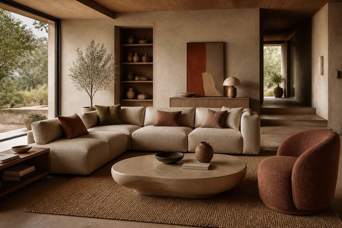
Build texture in layers so the room feels comfortable rather than busy. Start with durable base materials — wool or linen at the windows, a woven rug underfoot, wood with visible grain — then add softer contrast through pillows and throws.
A round jute rug brings an honest natural weave at a genuinely low price. Velvet pillow covers add depth in a small dose. A large ceramic vase with visible throwing marks reads handmade in a way a glossy one doesn’t.
Curves belong in this category too, because they’re about how a room feels rather than what it costs. Choose one or two rounded silhouettes that also do a job: an oval coffee table, or a round bouclé ottoman that works as a footrest, extra seat and storage at once. Keep at least 18 inches between a coffee table and seating so the shape reads as intentional.
There’s more on this in our guide to using Room Recipes and in our piece on curves in interior design.
Pattern, greenery and light
Start with one dominant patterned textile, then add a second at a different scale — broad florals with narrow stripes rather than two competing large prints. Keep one element consistent across the mix, usually a shared colour or a repeated fibre.
For greenery, one substantial plant beats several small ones scattered about. A faux olive tree solves the corner that never gets enough light for a real one, and a terracotta planter gives it the weight and texture a plastic nursery pot can’t.
Then lighting, which is where most rooms are still losing. Build at least three sources: ambient for general visibility, task where you actually do something, accent for depth. Table lamps on side tables and consoles create pools of warm light at eye level that a ceiling fixture never will. Use bulbs in the 2700K to 3000K range in living rooms and bedrooms, and put dimmers wherever you can.
A rechargeable picture light is worth singling out, because the wireless ones mount with adhesive and need no electrician — the cheapest way to make a wall look furnished after dark. Our layered lighting formula covers the full approach, and the best wall sconces guide handles the wall layer.
Where to spend and where to save
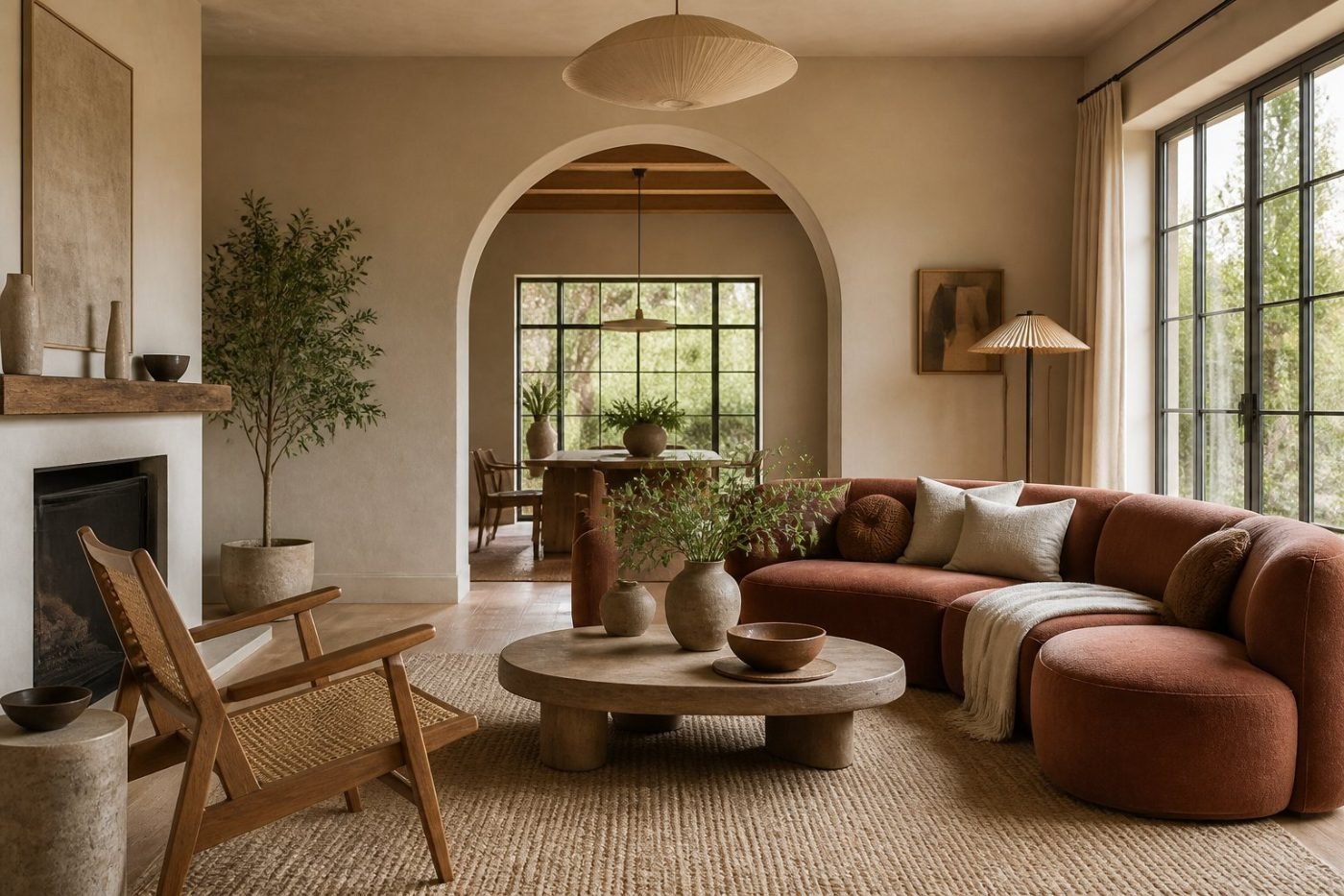
Put the money where the room gets used and where the eye lands first. A well-made sofa, a solid wood coffee table or a sculptural accent chair earns it — those take daily wear and set the room’s structure.
Save on the things you can swap without regret: side tables, lampshades, pillow covers, decorative storage. A set of woven baskets handles clutter for the price of a takeaway, and a ceramic table lamp changes the evening character of a room more than most furniture does.
If you’re working in order, this is the sequence that gives you the most visible change per pound spent:
- Lighting — warm bulbs, dimmers, a lamp at eye level
- Textiles — floor-length curtains, pillow covers, a decent rug
- Surface details — hardware, framed art, a good ceramic
- Paint — the warm neutral or the one deep colour
None of that requires new cabinetry or a renovation, which is the whole argument for this direction in the first place. Ready to shop it as a finished room? Start with our Room Recipes.